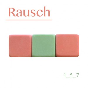
 Well, here we have another CD cover I’ve made. This cover didn’t take me too much time to do since the artist had more or less the idea of what he wanted for the CD Cover.
This person gave me a photograph that he took of various erasers that were put together, mostly green, pink and yellow (which is not seen in the final cover image). I’m not much of a fan of using photos for CD covers so for the first version of the cover I tried to more or less replicate the form of the erasers in Illustrator and used the same color for the rest of the elements.
As you can see in the thumbnail it is very different from the final versión.  The font I used in the thumbnail as well as the other elements were intended only for visualizing a bit better the composition in the form of a draft, so this person could see and decide if I should continue with this version or if I should change the concept. Of course the purpose of this is to not waste time on a concept which is not desired. But well, I had to redo all the art since the client wasn’t too happy with this concept and the photo was a must.
I guess I overcomplicated myself with this one and decided to simplify. I only stayed with the font of the numbers on the lower right and changed the color to green.
For the final versión I used the image that was given to me. I cropped it and ended up only displaying three erasers in the color scheme that I thought was best. I changed the font and color for one more appropriate. I think in the end the CD cover looks much better in the final version.
If you are interested in seeing for what this CD cover was used for, you may check it out by clicking here.

It was clever to include a track with the cover design. You can press the erasers they work.
Jajaja ok that was Rausch’s decision.